FlightDeck Dashboard
Sales Filters

Along the top of the FlightDeck Dashboard is the display of your current data filters. This defines the branches, current configured sales period, previous comparative sales period and any specific customers. All information on the FlightDeck Dashboard is based off of these filters.
To modify the filters, you would click the Current Data Filters link, and the filter selections will slide down
Sales Summary Tiles

The FlightDeck Dashboard breaks down your sales into 6 metrics, which are filterable based on total sales, online sales, in-store sales, cash sales or charge sales
Note that the Net Sales value may be effected by online orders that were returned in store - currently there is no way for a return to be processed as having originally been purchased online.
Tile Values
Net Sales
The net sales tile is the total value of all products that were sold, minus the value of any items that were returned.
GP $
The gross sales tile is the total value of all products that were sold.
GP%
The Average GP% is calculated based on all sales tied to your Salesrep ID for the given month, where the total value of the invoice is greater than 0. This value is calculated by taking the value from the Total Sales tile, subtracting the cost of all the sold items, and then dividing by the Total Sales tile value.
Total Invoices
The total invoices is calculated based on all sales tied to your Salesrep ID for the given month, where the total value of the invoice is greater than 0. For invoices with more than one line item each invoice number is only counted once.
Average Invoice Lines
The average number of lines per invoice is calculated based on the total number of lines processed for the given month, divided by the total number of invoices over the same period.
Average Invoice Value
The average invoice value is the sum of all invoices values for the given month, divided by the number of invoices over the same period.
Warning: If you start switching between the three different filters without giving the numbers the chance to recalculate successfully, it is possible to end up with a mix of values from the different filters.
Quick Account Stats
These are 3 tabs outlining some basic account based metrics
- Active Customers - Number of customers with sales within the set timeframe
- New Customers - Number of customers added to the system within the set timeframe
- Average Days of Receivables - Current average number of days receivables (does not adhere to the filters)

Sales Breakdown Graph
The Past Month Sales By Filter graphs give you a quick visual representation of the breakdown of your sales of the current period compared to last period, based upon the current data filters
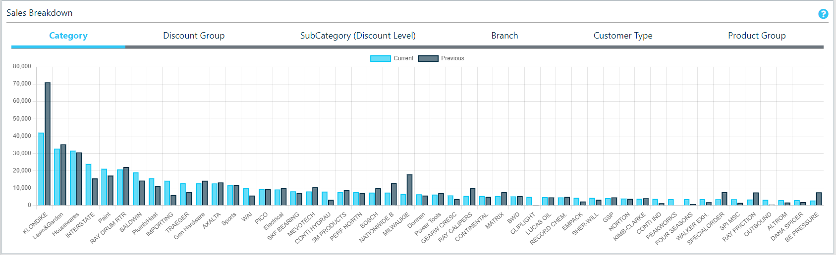
By Category
Filtering by category gives you a breakdown of your sales per category associated with a product.
Limited to top 25 Categories.
By Discount Group
Filtering by Discount Group, as defined within COUNTERPOINT.
By Class
Filtering by class gives you a breakdown of your sales per class associated with a product. Any sales involving products that do not have a class associated with them will not be represented by this graph.
Limited to top 25 Classes.
By Branch
Filtering by branch gives you a breakdown of your sales per branch associated with the sale.
By Industry
Filtering by industry gives you a breakdown of your sales per unique industry value you have assigned to customers via Counterpoint. If you have active customers that do not have an Industry value associated with them, those sales will not be represented by this graph.
Note that for all graphs some of the labels may not appear for given columns, depending on the size of your screen. To view the name for a column that did not appear, mouseover or tap either value from the column.
Sales By Day
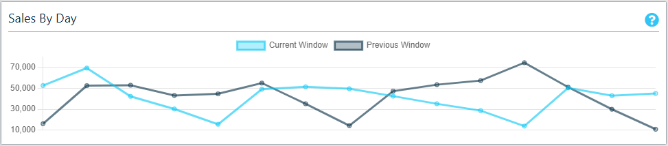
MTD Sales By Day shows all of your sales to date this month, on a daily basis. Each node on the graph represents a day this month, allowing you to easily spot patterns and irregularities in your sales.
Sales By Day is available as both a comparative and a cumulative chart.
Cumulative Sales

The cumulative sales graph shows the running total of sales over the specified period. This allows for a visual representation of any outliers that don't fit in with the sales trends over a longer period of time.
Top Customers
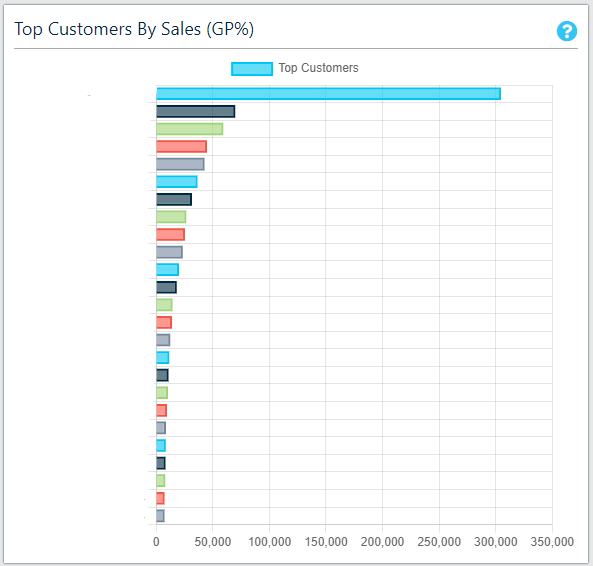
The Top Customers Chart shows your top 25 customers over the current period, based on total sales value.
In the event that one of these customers has a negative sales value, the graph will grow to the left, below the 0 value.
To display the exact value of the sales for a given customer, mouseover the coloured bar that represents the customer.
In the event that you are viewing a period for a specific customer, this graph will instead display as "Top Clerks" and display the top 25 clerks for sales made by the customer, over the current period.
Top Clerks By Sales
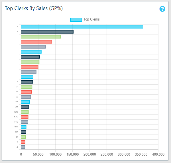
The Top Clerks Chart shows your top 25 clerks over the current period, based on total sales value.
In the event that one of these clerks has a negative sales value, the graph will grow to the left, below the 0 value.
To display the exact value of the sales for a given clerk, mouseover the coloured bar that represents the clerk.
Top Sales By Rep
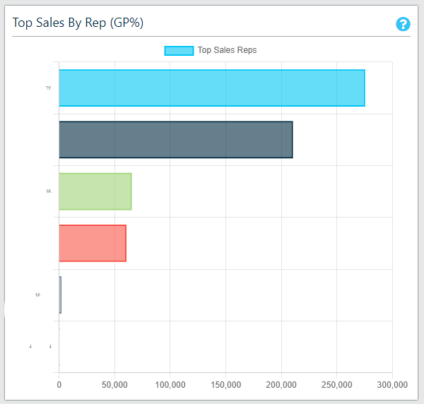
Top sales by rep shows your sales by sales rep. Hovering over the bars will display the detailed total sales figure
Monthly Sales History
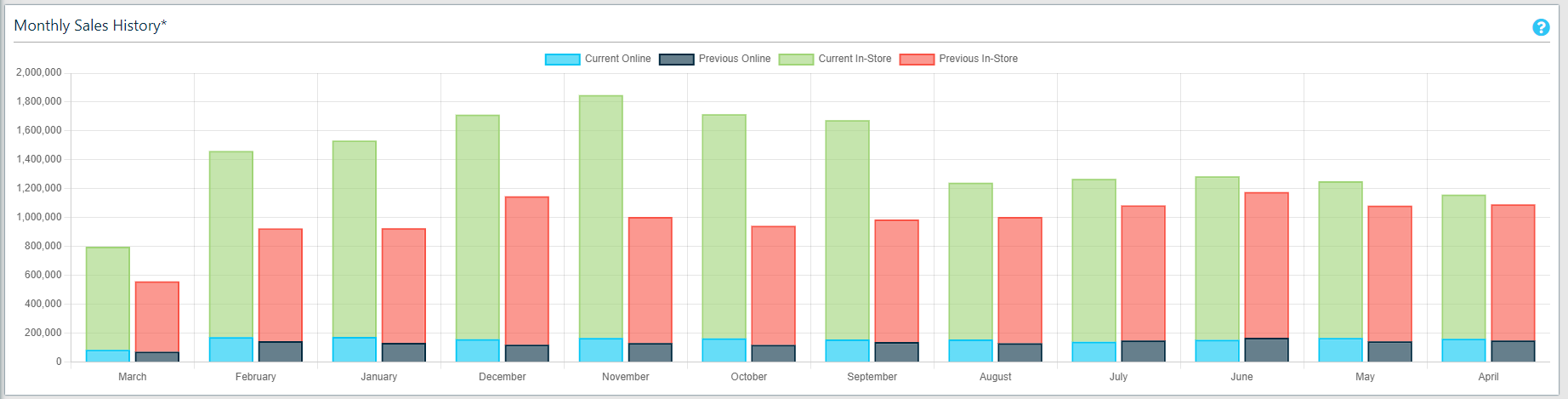
This graph shows the past 12 months sales, by month, compared to the previous year in a stacked graph showing online and in-store sales.